Wally Home


Role

UX Intern

Tools

Adobe XD

Duration

2 weeks

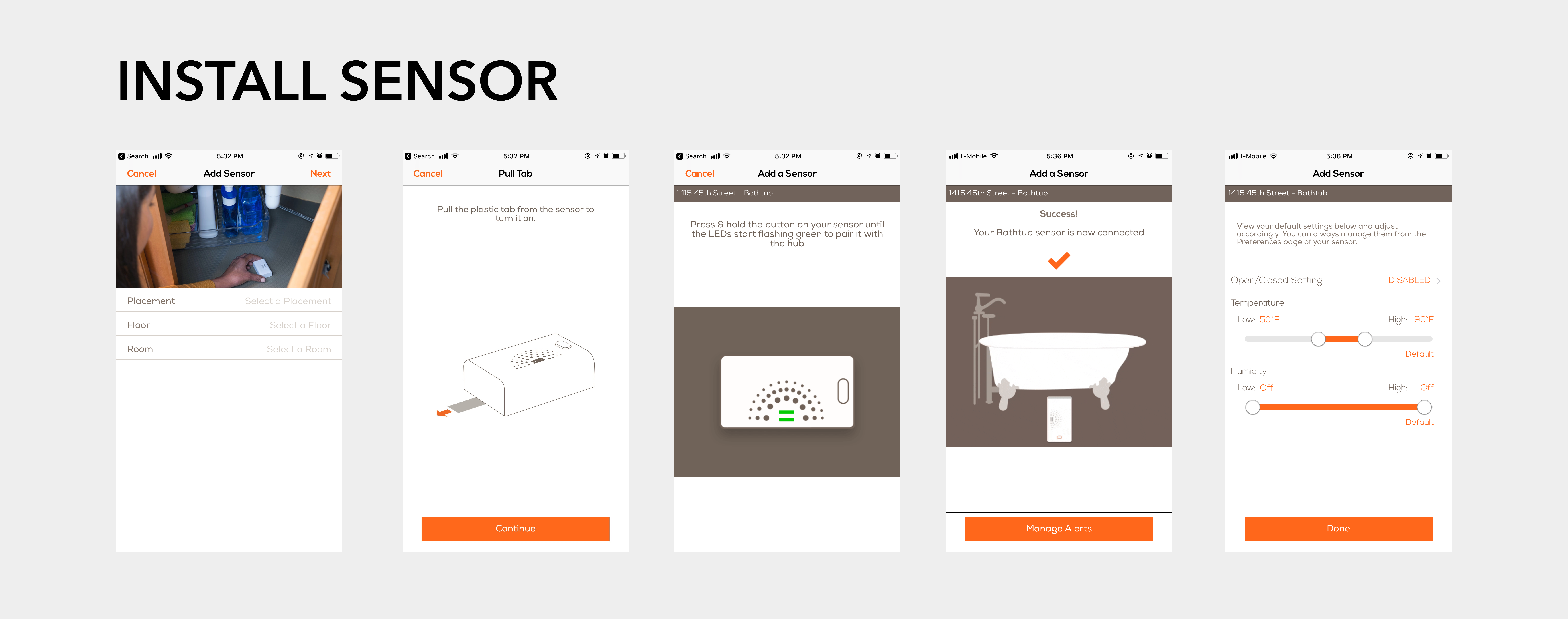
While I was at Wally, I was assigned a special project by the Manager of Software Engineering. This project involved a redesign of the Wally Home application which helped users with the installation of Wally Products.


Problem

The Wally App had several flaws that hindered product installation.

  • Installation was a prerequisite to using the products
  • Current installation instructions were daunting to a non-technical user
  • Incorrect installation resulted in problems during the use of the product

Furthermore, it had several issues that degraded the overall experience of using the application:

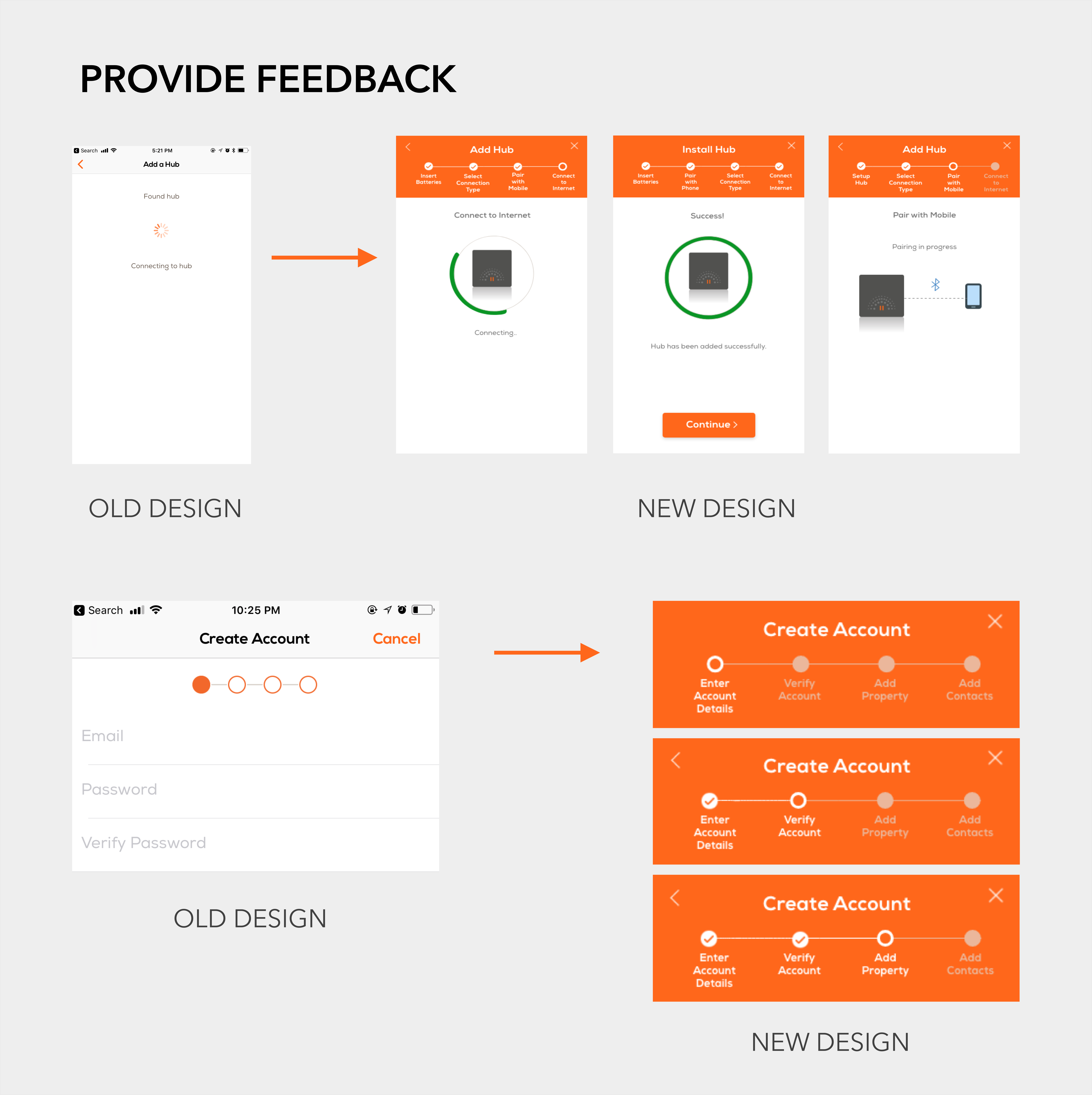
  • There was a lack of feedback that was given to the user which resulted in a lot of confusion
  • The exact number of steps required to complete an installation activity was not stated which resulted in user impatience
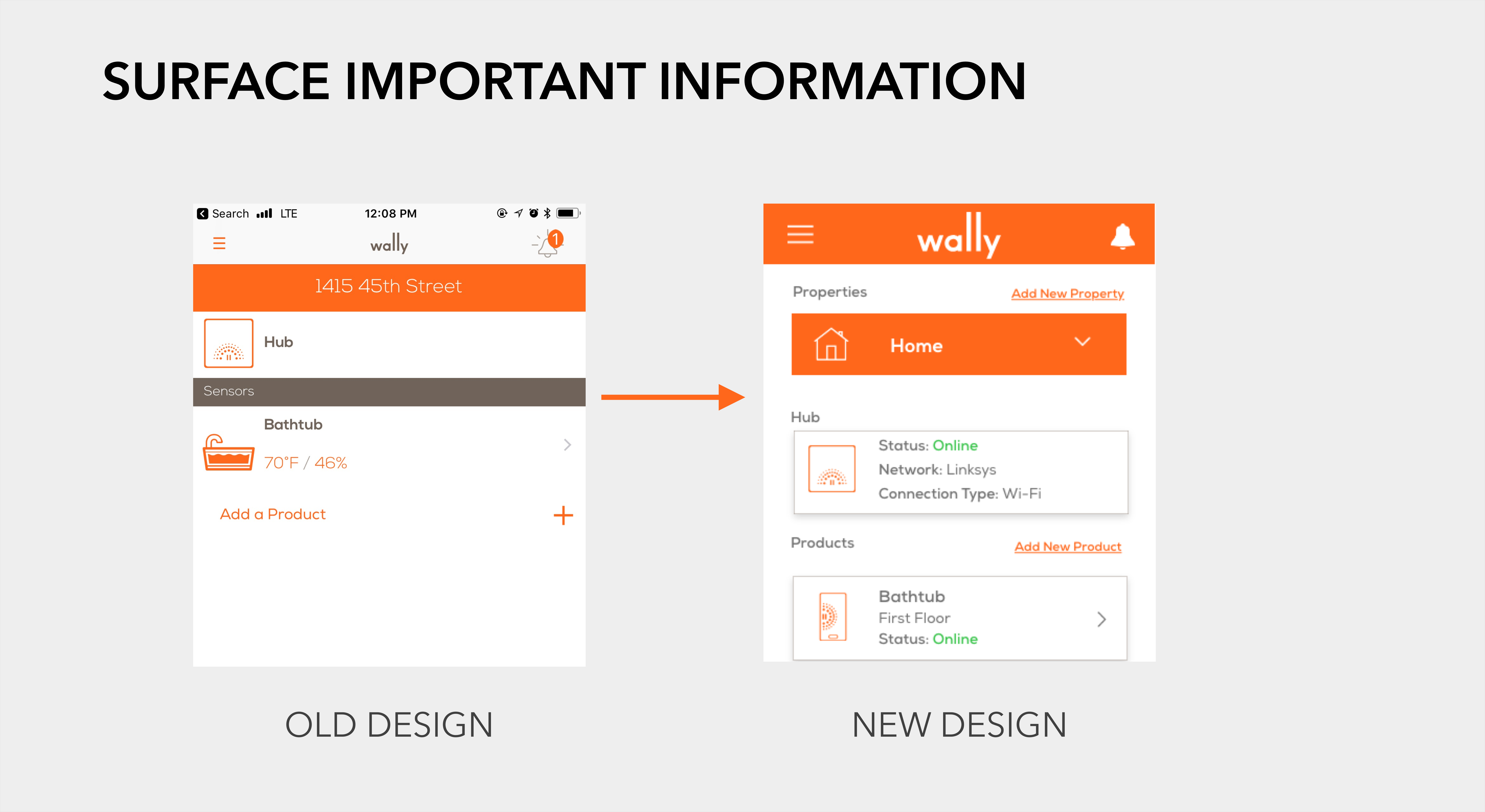
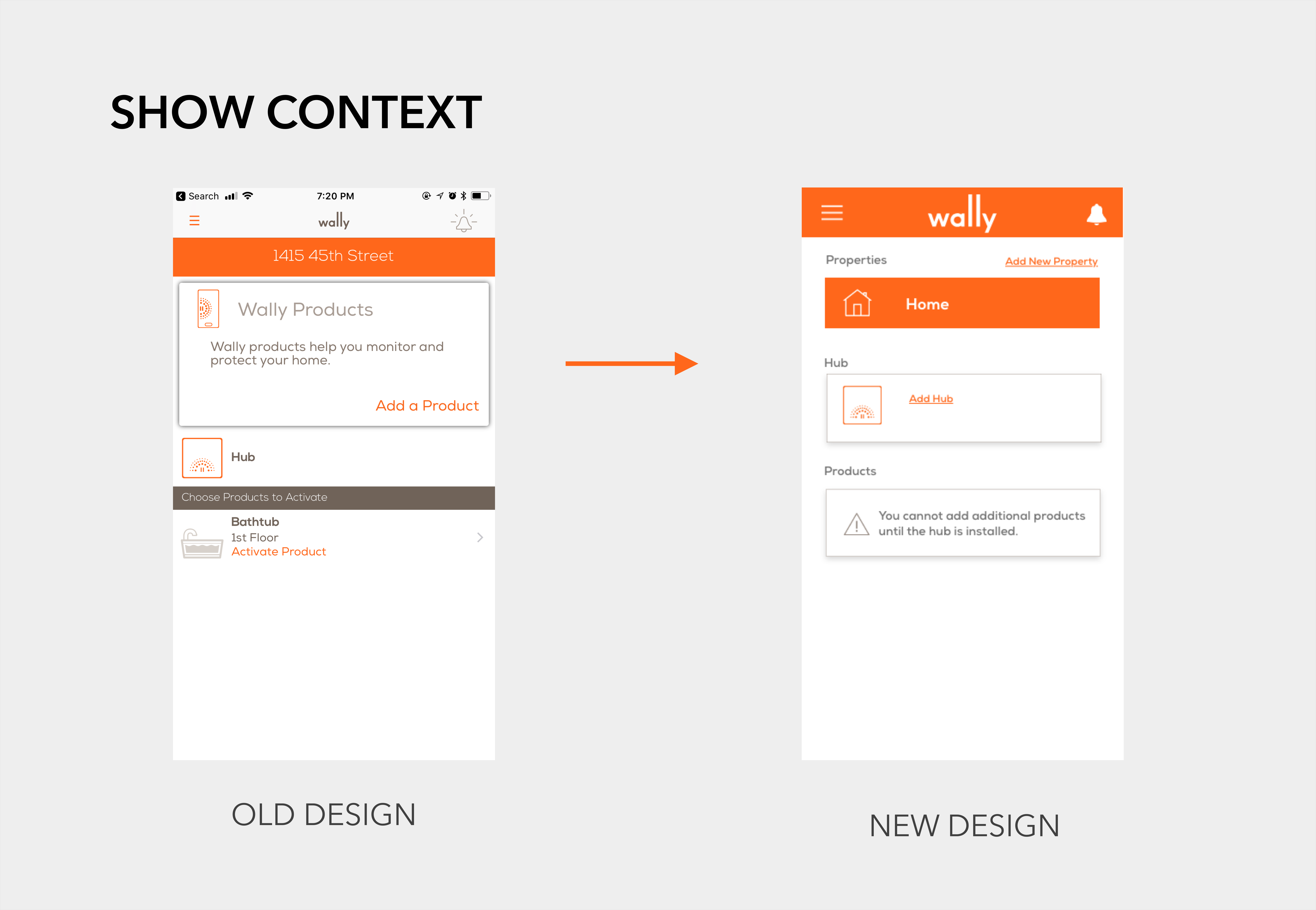
  • Important contextual information was buried in the application and was not easy to search for
  • It was difficult to monitor alerts for multiple properties

Background

Wally Products

The Wally Home mobile application helps the user to install the Wally Product suite.
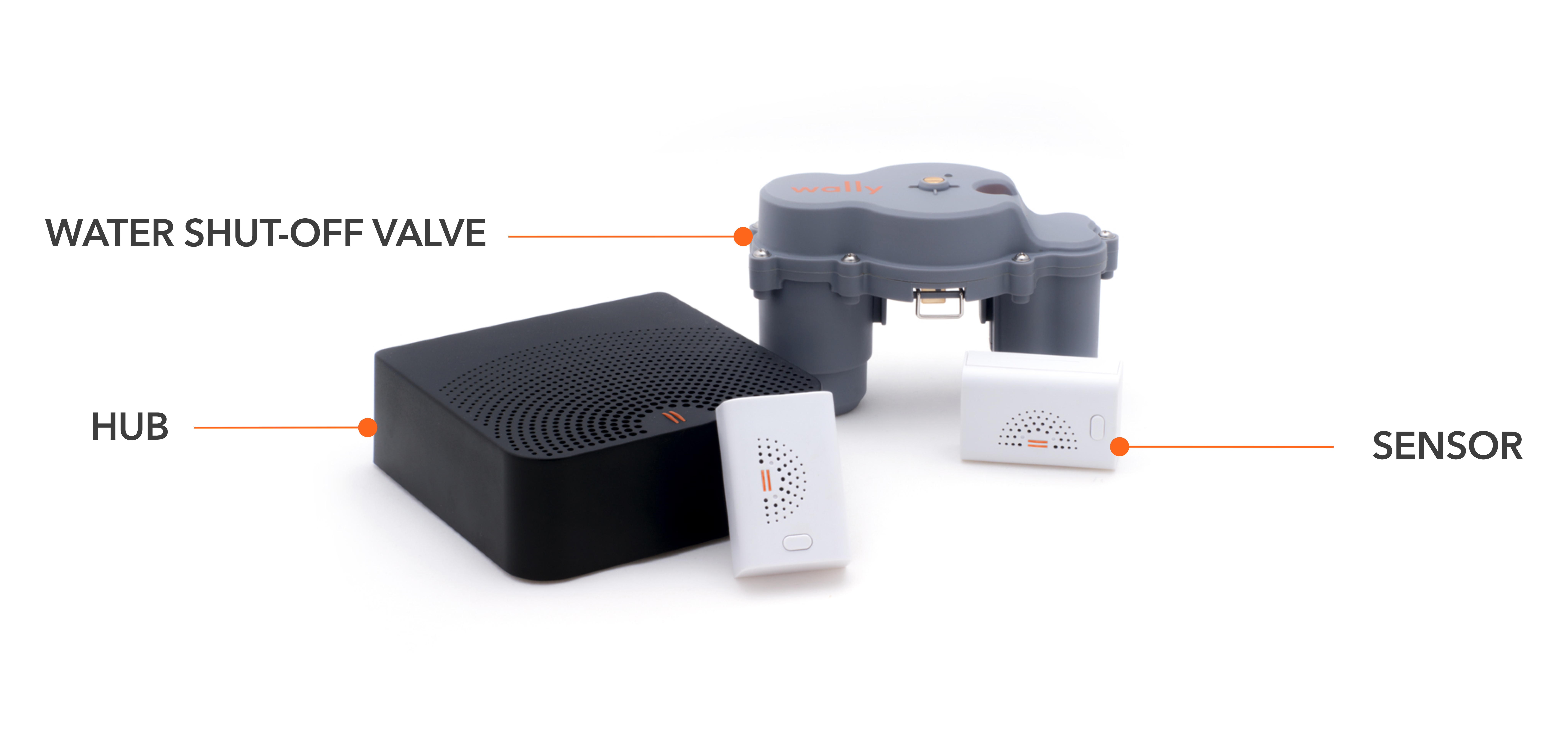
The Wally Product Suite consists of:

  1. The Hub: This is the most important part of the system or the ‘brain’ of the system which communicates wirelessly with all the Wally products. In case of an emergency; the Hub alerts the users using an audible alarm.
  2. The Sensors: These are the various ‘organs’ of the system which are equipped to detect water leaks, temperature and humidity changes, and open doors/windows.
  3. Water Shut-Off Valve: The Shutoff Valve closes automatically when a leak is detected by Wally Sensors.

Wally App

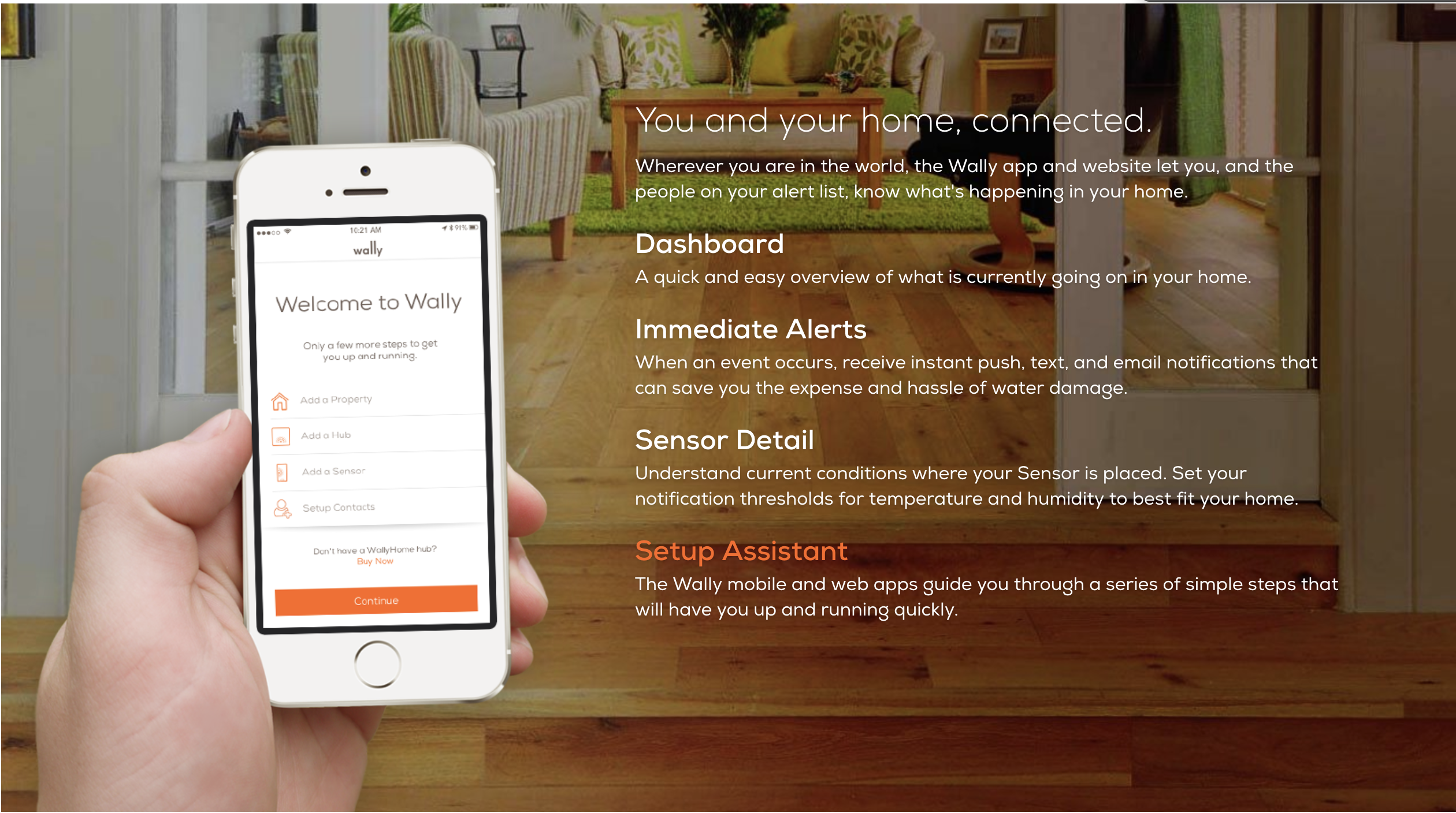
The Wally App is one of the first touch points of the user with Wally. The app has 4 primary functions

  • It has an interactive dashboard which provided the user with an overview of the system
  • It sends the user notifications for each alert
  • It helps the user monitor the different sensors
  • It helps to install the products

Process

Research

Given the short duration of this project, I did not have sufficient time to do comprehensive research.

I conducted a few think-aloud tests by asking my friends and colleagues to install the application. I then constructed a journey map based on those observations. This journey map allowed me to identify the highs and the lows of the user journey
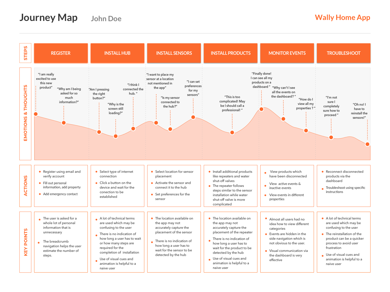
Highs

  • Breadcrumb navigation
  • Use of visual cues and animation
  • Dashboard overview

Lows

  • No feedback while the application is loading
  • Lack of indicators for current status and progress
  • Use of technical terms and metaphors
  • Buried content

Defining Scope

Given the short duration, I decided to focus on three main flows which had the most number of steps. Many users had problems with these flows and they were extremely important to product installation as successive flows depended heavily on them.
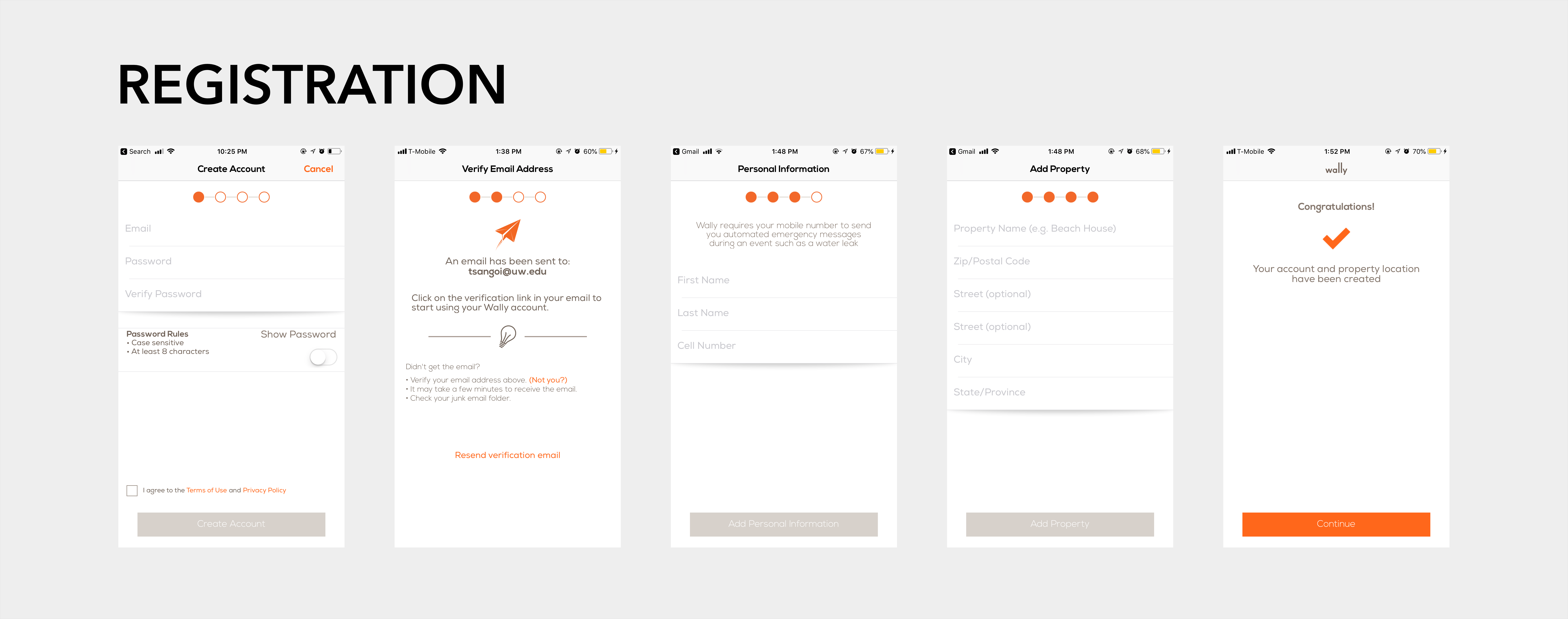
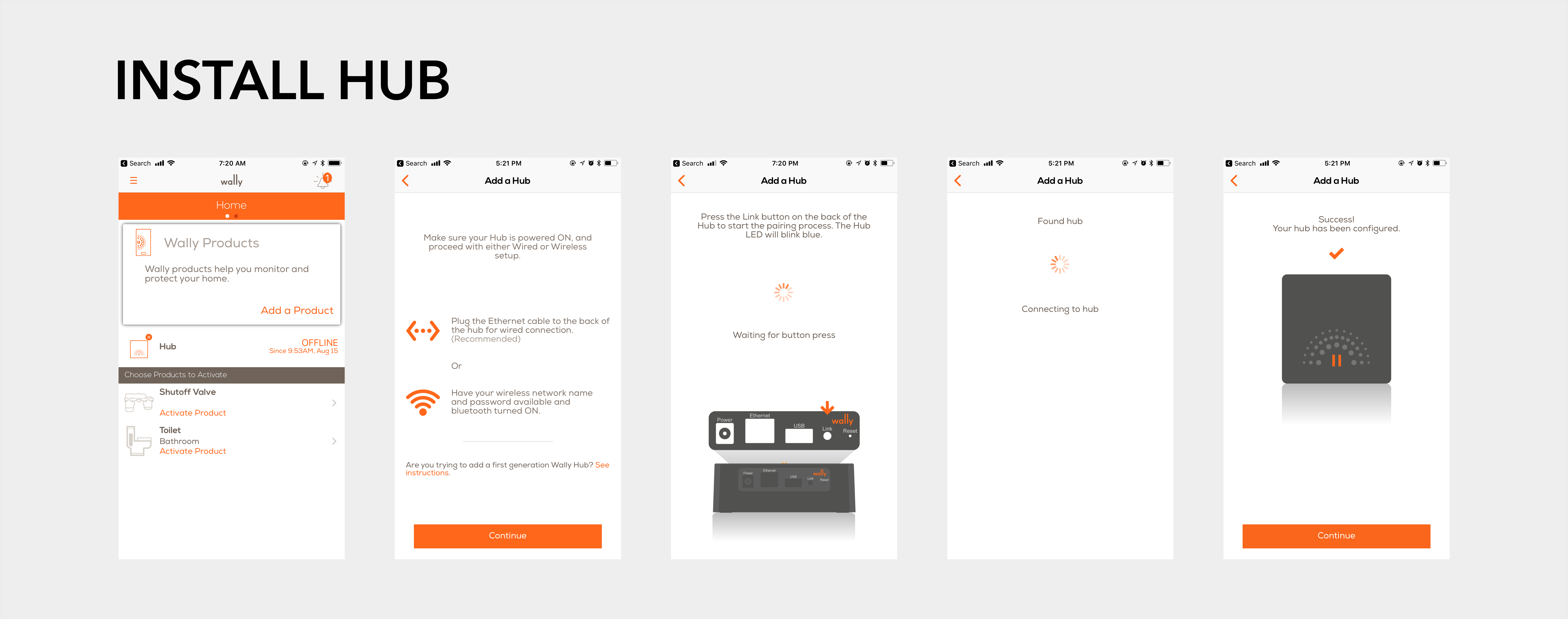
Defining Scope

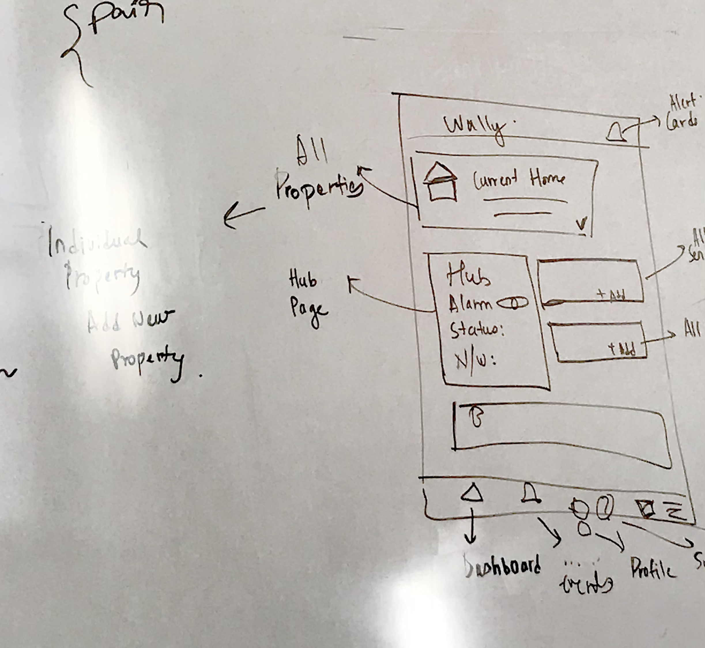
I began by sketching my ideas out on a whiteboard. I also talked to engineers to understand the back end APIs that facilitated product installation.
Solution

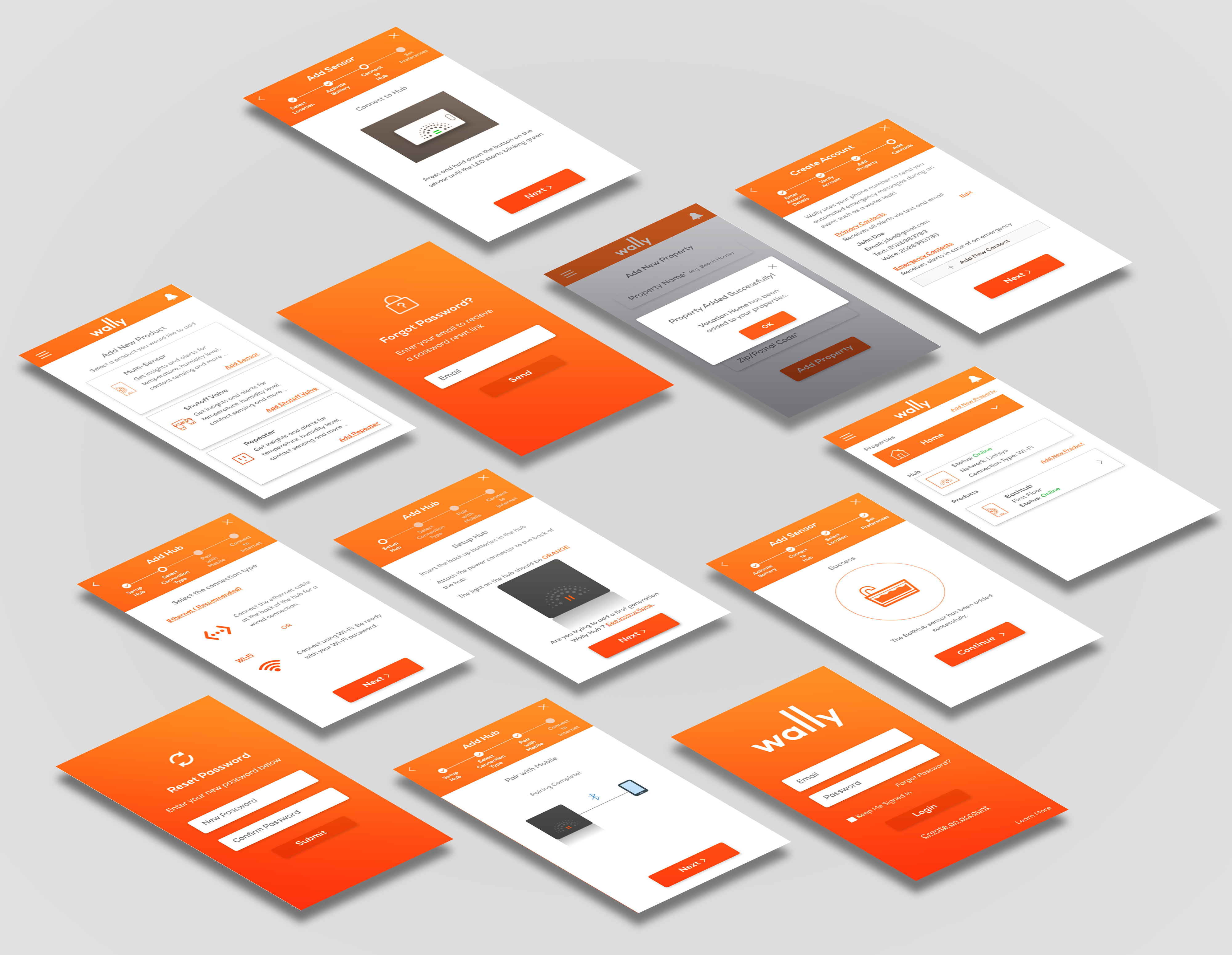
The new redesign attempted to tackle the issues mentioned above by:

  • Showing contextual information wherever necessary
  • Surfacing important information
  • Providing feedback

Outcome

I presented my final redesign to a panel of the product manager, engineers, customer support specialist and also a few remote designers that were associated with the company.

The manager of software engineering who had assigned me this project was really impressed by this redesign. Furthermore, the customer support specialist who helps people with the installation process on a regular basis said that the redesign would greatly reduce the calls he would receive.

Some of my other work...